Summary
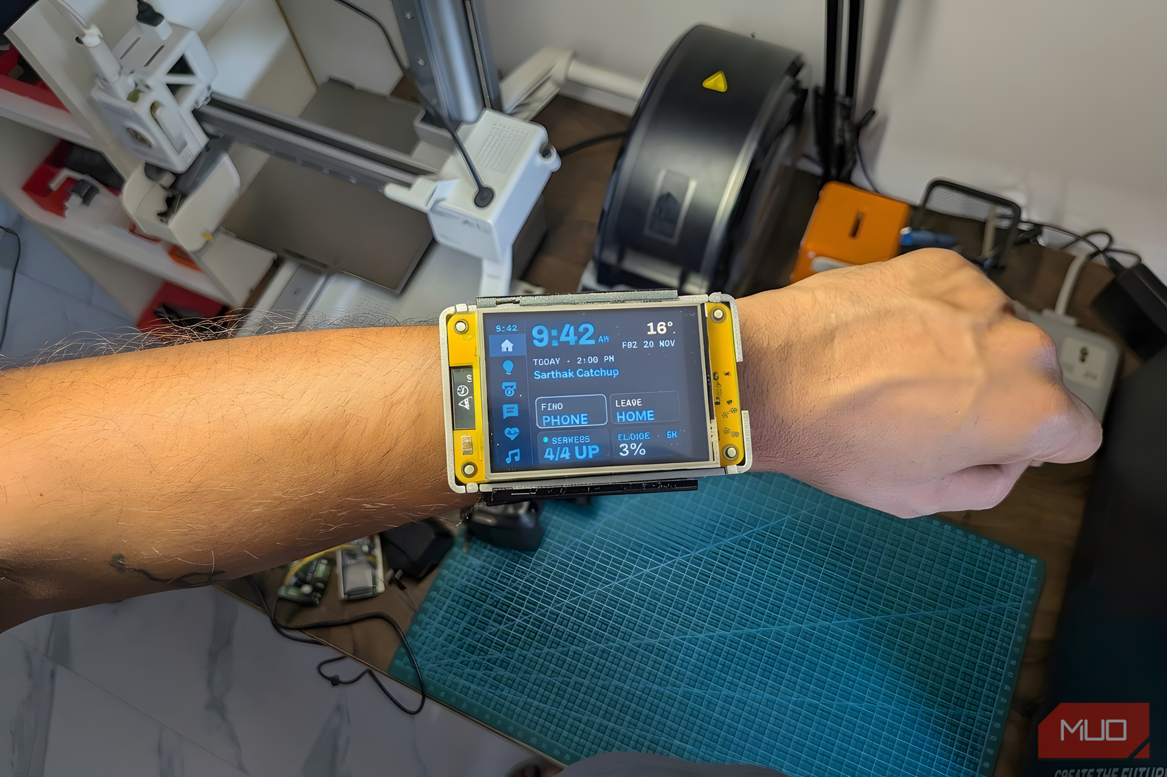
Smartwatches have come a long way, but they’re still tiny screens running on closed platforms that you have to be content with. But I wanted more. I wanted something that could fit my lifestyle better, provide the features I wanted, and not cost me $500. Most importantly, I wanted to decide how all of that worked. And that’s how an ESP32 touchscreen became a slightly ridiculous, deeply personal wrist computer. Calling it a smartwatch does require some generosity, but it’s a device built for me, not the other way around. I strapped a Cheap Yellow Display to my forearm It’s not a smartwatch, but it’s finally one that listens to me The first and only major component of this build is the ESP32-2432S028R, otherwise called the CYD, short for Cheap Yellow Display. It’s a 2.8-inch resistive touch TFT display with an ESP32 bolted to the back. The whole thing runs as a unit and has JST connectors on its sides to add sensors and batteries. It’s also a larger, rectangular screen, meaning I can work with a more traditional layout instead of being forced into a much smaller circle or vertical rectangle. That extra screen space might make the device look like something out of a Fallout game, but it matters. This isn’t an attempt to build a thinner fitness tracker. It’s a dedicated interface for things I want within reach, with room for readable information and useful controls. As such, I kept the first version focused. It shows phone notifications, messages from my in-house Home Assistant-based messaging system, 3D printer controls, and a leave-home action. It’s currently powered by USB, so the battery, a better wearable enclosure, and more ambitious features follow once I get the basics right. Six tabs, one clock, and zero apps I didn’t write ESPHome and LVGL handle the screen, my phone handles the colors The firmware uses ESPHome and LVGL, with a clock and six navigation tabs along the left edge. Those tabs cover my home, lights, prints, an inbox for messages, health stats synced from my phone, and media controls. The home screen combines the time, temperature, and next calendar event with four tiles that include features like finding my phone and my leaving-home automation. The other two buttons show the status of my Docker containers and Claude Code usage. I can even control the color and scenes for my smart lights by heading to the lights tab and tapping and holding the light I want to edit. Even the accent colors follow my phone’s Material You theme. That won’t make the console more capable, but it helps a homemade interface feel like an extension of my phone instead of something I bolted on later. Home Assistant does the actual work Stopping a print needs a long press, because fat fingers exist Home Assistant provides the connection between those controls and the rest of my setup. I created scripts for leaving home, finding my phone, and sending phone media commands, rather than treating the touchscreen as an isolated gadget. The printer page brings progress, estimated completion time, chamber lighting, and pause or resume controls. Stopping a print requires tapping and holding, as that’s one action I don’t want an accidental touch to trigger. Home messages sent via Home Assistant between my flatmates and me travel to both my wrist and a small e-paper display I added to my desk. Other pages are unapologetically specific too. One monitors my servers and supporting services; another displays Claude usage bars, reset times, and the context consumption of the current model. Small details, and the bugs that came with them A screensaver, an RGB LED, and a pop-up that refused to cancel Since I didn’t want the home interface sitting on my wrist every day, I also designed a screensaver that shows the time and features a bottom strip that rotates between printer information, calendar details, and music every 10 seconds. Swiping changes the item, and tapping opens the corresponding page. The screen also features an RGB LED at the back, and I pulse it in different colors to highlight alerts and notifications. It’s also planned to have a decorative bloom effect when it’s charging, but that’s yet to come. But getting here required some less glamorous work. Fixing a pop-up cancellation error, untangling overlapping labels, shrinking oversized tile text, addressing compiler warnings, and ensuring the display and touch are oriented correctly are all tasks that’ll have you staring at your screen helplessly if you don’t know where to look. Making a screen this big wearable is mostly optimism A PETG tray, a TPU sleeve, and a honeycomb I haven’t measured I’m currently testing my battery electronics and overall battery life with an enclosure design that pairs a PETG tray with a one-piece TPU sleeve. The setup is a 3.7V LiPo cell, a TP4056 module for charging, and an MT3068 to power the ESP32. The tray just slides into the TPU sleeve and has space underneath for sensors and battery-related electronics. It’s not the best design, but it allows me to wear the device as I work out its software quirks and understand how a screen this big behaves on my forearm. The sleeve itself has an elongated honeycomb pattern intended to stretch over my hand. That still needs a real measurement and fit test; the current design is based on crude measurements, guesses, and a fair bit of optimism. It beats a smartwatch at exactly one thing It was built for me, so I’m the only one it has to impress This project doesn’t really beat a commercial smartwatch at everything. Several important pieces still need testing, and the enclosure itself is going to take me a while to figure out. It’s also not quite something I can wear everywhere, but given how much time I spend indoors in my workshop, it fits my setup perfectly. It’s based on an interface that reflects my priorities down to the individual button, printer action, and message reply. For now, that freedom is the achievement: a wrist computer designed around my home, rather than another gadget asking me to work around its limitations.