Summary
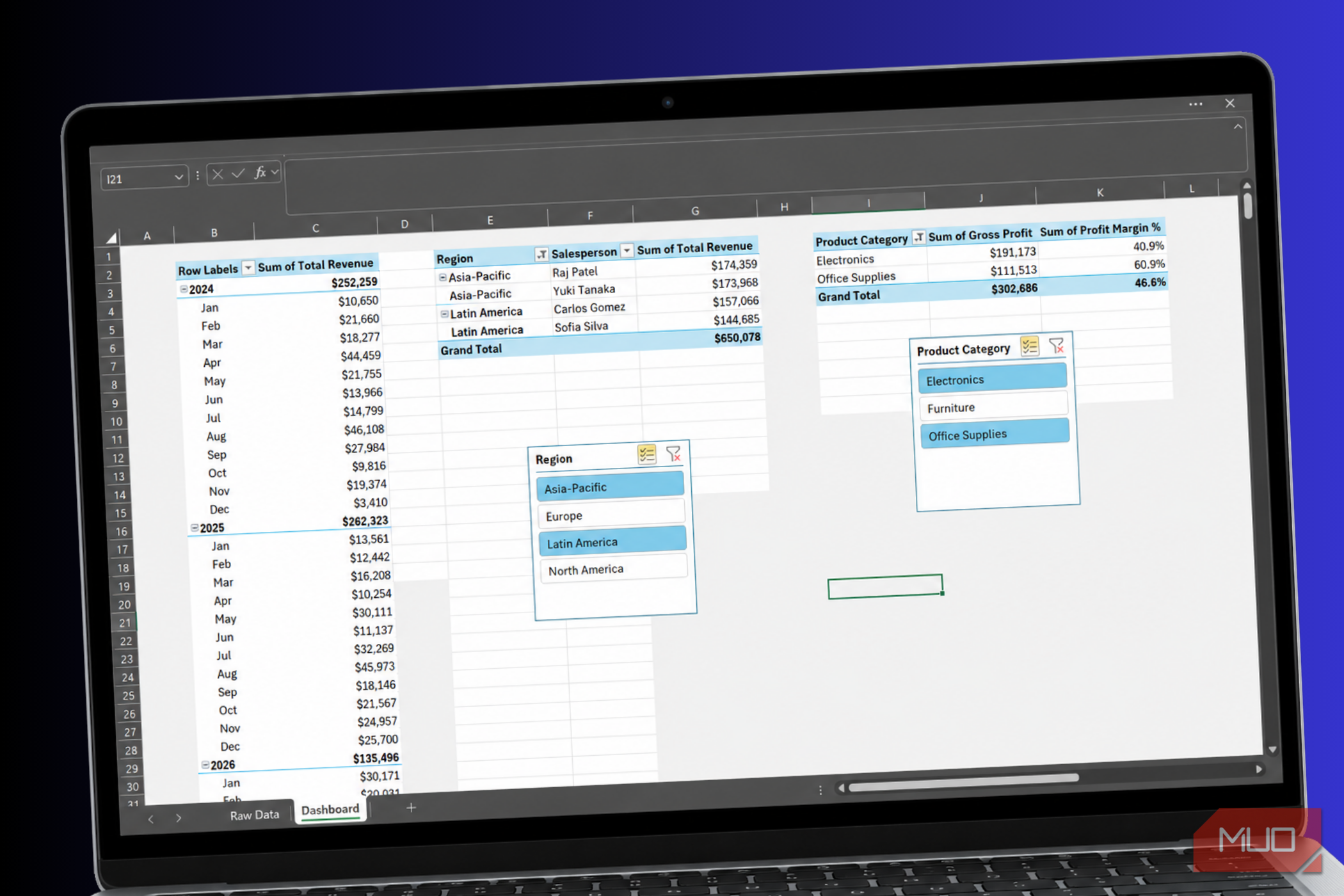
Most people assume that building a dashboard in Excel always means designing charts, applying colors, or even turning to Power BI or Tableau just to show their boss how sales are trending. I used to think the same until I realized I was overcomplicating something I could easily achieve with PivotTables. What I built took less time than my coffee break, looked polished and clear enough to present to my bosses, and updated itself with a single click. I know I’ll be using this method a lot more going forward. How to build a dashboard using PivotTables Not everything is about fancy charts The trick to building an interactive dashboard with PivotTables is splitting your data into several smaller, focused PivotTables and placing them side by side on the same sheet. Think of each one as answering a single question instead of trying to answer everything at once. For a project management dashboard, that might look like one table listing active projects, another breaking down tasks by owner, and a third tracking completion percentages. Together, they tell a complete story without overwhelming anyone. Keep your raw data on a separate worksheet while reserving a dedicated dashboard tab for summarized, easy-to-read PivotTables. Once your tables are in place, you can start making the data easier to interpret. Instead of displaying a long list of individual dates, group them into months or years. Instead of showing scattered revenue figures, bucket them into ranges like 1,000, so trends become much easier to spot. The layout also makes a bigger difference than you might think. Under the PivotTable Design tab, switching to Tabular Form or Outline Form makes a PivotTable look more like a structured report than a default spreadsheet export. Turning on Repeat All Item Labels reinforces that database-like layout, which is especially useful if you’re sharing the file with someone unfamiliar with PivotTables. You can also add calculated fields. This lets you insert your own formulas directly into the PivotTable to build KPIs, flag completion statuses, or create custom metrics that don’t exist in your raw data. To make the dashboard truly interactive, add slicers. Slicers are clickable filter buttons that float above your tables, making it easy to explore the data without changing the underlying PivotTables. Although they’re quite useful, they’re also one Excel feature many users don’t even know exists. Select Insert Slicer, choose a field such as Department or Revenue, and place the slicer anywhere on your dashboard. If you use the Report Connections option to link every PivotTable to that slicer, selecting a category filters every connected table at once. Whenever you add new rows to your source data, all you have to do is select Refresh All from the Data tab, and every PivotTable on the dashboard recalculates automatically. Building an interactive sales dashboard from a 1,000-row dataset It took me all of five minutes I have a 1,000-row dataset that includes columns for dates (spanning 2024–2026), product categories, salespeople, regions, quantities, revenues, and costs. I renamed the sheet Raw Data and converted the dataset into an Excel Table. When you’re converting your dataset into an Excel Table, make sure the My table has headers box is checked. Converting your data into an Excel Table makes it dynamic, so when you add new rows later, your PivotTables automatically detect them without requiring you to redefine the data range. Next, I set up my dashboard tab. After creating a new worksheet and renaming it Dashboard, I selected columns A–Z, navigated to the Home tab, and changed the fill color to a very light gray (#F2F2F2) to give the dashboard a clean, app-like background. With the dashboard sheet ready, I created my first PivotTable to visualize revenue trends over time. I placed the PivotTable on the Dashboard sheet in cell B3, dragged Date into the Rows area and Total Revenue into the Values area, and then grouped the dates by right-clicking the PivotTable, selecting Group, and choosing only Months and Years. Finally, I formatted the revenue values by selecting Value Field Settings → Number Format → Currency, setting the decimal places to 0, and clicking OK. Instead of returning to my raw data sheet to create each PivotTable from scratch, I copied the first one and pasted it twice to save time. I used one copy to show salesperson standings by dragging Region and Salesperson into the Rows area and Total Revenue into Values. For the other, I dragged Product Category into Rows and added two calculated fields because my source data didn’t include Gross Profit or Profit Margin columns. To create the calculated fields, I clicked inside the PivotTable, opened the PivotTable Analyze tab, and selected Fields, Items, & Sets → Calculated Field. In the first Name box, I entered Gross Profit and used this formula: =‘Total Revenue’ - ‘Total Cost’ For the second calculated field, I entered Profit Margin % and used this formula: =(‘Total Revenue’ - ‘Total Cost’) / ‘Total Revenue’ I also made a few layout changes to improve readability. For my second PivotTable, I opened the Design tab under PivotTable Tools, selected Report Layout → Show in Tabular Form, returned to Report Layout and chose Repeat All Item Labels, and then selected Subtotals → Do Not Show Subtotals. These changes made the table read more like a clean database grid than a default PivotTable. For the third PivotTable, I formatted the Sum of Gross Profit as Currency with 0 decimal places and Sum of Profit Margin % as Percentage with 1 decimal place. After making those adjustments, I added two slicers to make the dashboard interactive: one for Region and another for Product Category. I placed them beneath the second and third PivotTables and linked them to all three tables. Since they’re all linked, a single click filters the entire dashboard simultaneously. Whenever I add new sales transactions to the bottom of the table in my Raw Data sheet, all I have to do is go to the Data tab and select Refresh All. Alternatively, I can press Ctrl + Alt + F5, and every PivotTable and chart on the dashboard updates instantly to reflect the latest data. The easiest dashboard you’ll ever build After building an interactive dashboard using PivotTables, you might wonder why you spent so much time designing dashboards in the first place. All the tools are already built into Excel, and with a little organization, you can turn raw data into something that’s clear, interactive, and easy to understand at a glance. Whether you’re tracking sales, projects, or any other kind of data, there’s really no reason not to give this method a try.