Summary
Carrier coverage maps are typically a dizzying array of colors overlaid in different geographic areas, hopefully indicating that you’ll be able to pick up that premium, ultra-fast 5G signal. Except when it’s not showing what you think, because carrier maps are largely built from predicted area coverage rather than specific measurements — and US regulators let it stay that way, even if it means you might end up without proper reception. Thankfully, there is a better way: real phones, on real networks, building real coverage maps that you can actually check before switching carriers. Carriers don’t measure every single bit of the map Coverage predictions dressed up as facts The biggest issue with any carrier cell coverage map is that, by law, the very company selling you on their coverage doesn’t need 100 percent accuracy. In fact, the accuracy, which I’ll explain in a moment, is lower than you’ll expect, while the map itself is built from tower locations, terrain data, and antenna specs into propagation-modeling software — the same category of tool that predicts Wi-Fi dead zones in an office floor plan, just scaled up to a state. As you might expect, the FCC has its part to play in all of this, both positive and negative. For 5G, the FCC’s rules on coverage maps demand coverage propagation with:
- Minimum download speed of at least 7 Mbps and upload speed of at least 1 Mbps, with a minimum cell edge coverage probability of 90% and a cell loading of at least 50%.
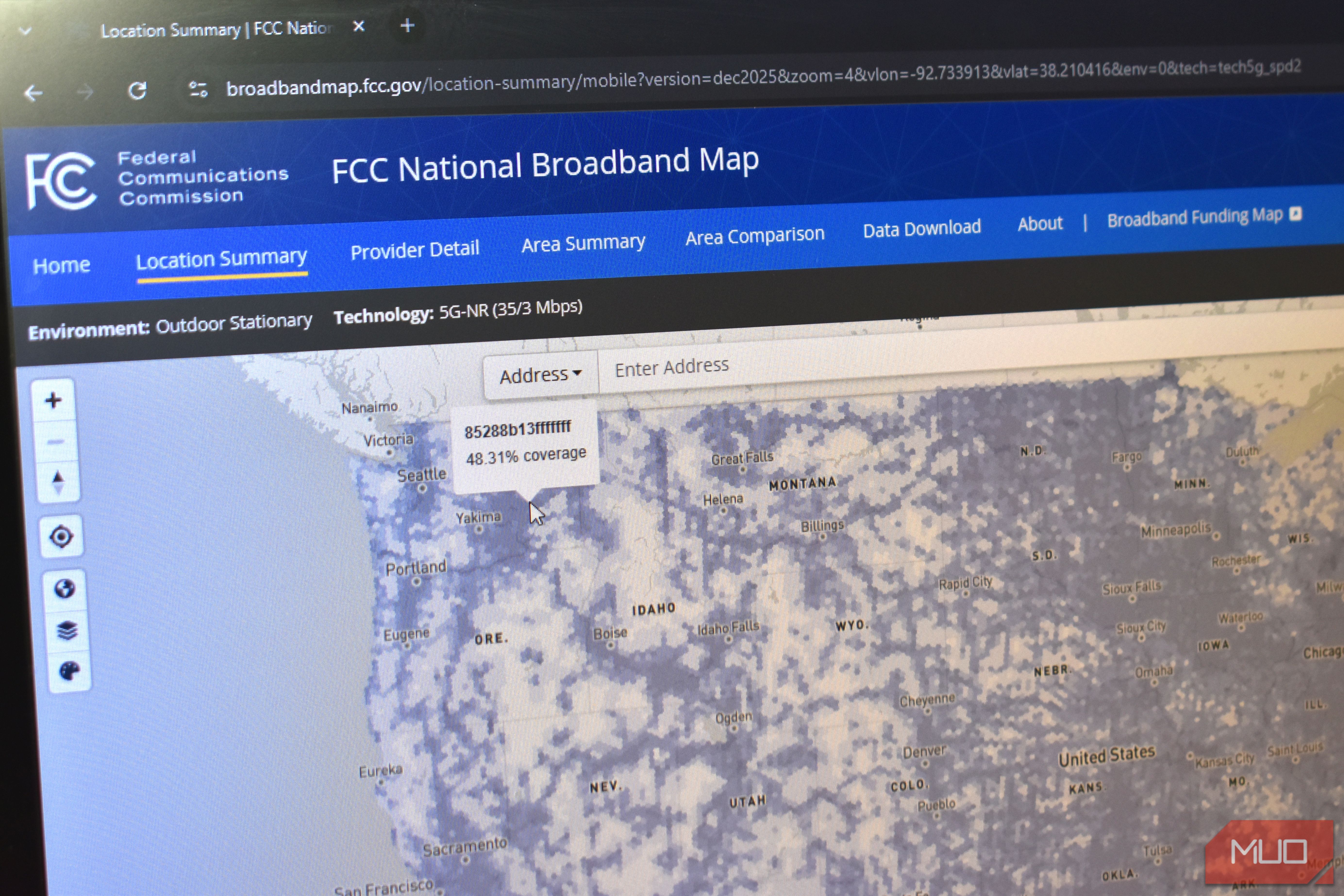
- Minimum download speed of at least 35 Mbps and upload speed of at least 3 Mbps, with a minimum cell edge coverage probability of 90% and a cell loading of at least 50%. So, 90 percent coverage of a specific region must be covered for a carrier to show regional coverage in that area. So far, so reasonable. The FCC’s testing found most carriers weren’t even doing that But there is a caveat to this issue But it gets a bit murkier when you read the FCC’s own report [PDF] on how much carriers overstate their coverage, by as much as 40 percent in some cases. Through the investigation, staff discovered that the MF-II coverage maps submitted by Verizon, U.S. Cellular, and T-Mobile likely overstated each provider’s actual coverage and did not reflect on-the-ground performance in many instances. When the FCC sent engineers to drive-test those predictions against reality, the results were rough. Across a batch of rural tests, only 62.3 percent of runs hit the minimum download speed the maps promised. US Cellular hit that number in 45 percent of tests. T-Mobile managed 63.2 percent. Verizon came in at 64.3 percent. However, there is a but, and that is that those figures were taken in a 2019 study; the FCC technically hasn’t repeated a nationwide carrier accuracy test since then. That doesn’t make the figures completely wrong, but for this purpose, they’re seven years out of date. Either way, it illustrates that the carrier maps can be both legally accurate and still misleading, which is why carrier-map alternatives are so important. Enter: the FCC’s National Broadband Map Now we’re accurate, right? In November 2022, the FCC launched the National Broadband Map, which is where the “technically” comes into play in the previous paragraph. It features both a wired and wireless broadband map, with the wireless section giving some insight into overall mobile coverage, with options for 3G, 4G, 5G (7/1 Mbps), and 5G (35/3 Mbps) — and importantly, last updated on December 31, 2025. But it’s also still not showing what you think. It’s not absolute coverage of that network type within the hex; it’s the percentage of total coverage across the entire area, which you can see changing drastically when switching between 4G, 5G, and so on. The FCC actually has a crowdsourcing app, the FCC Mobile Speed Test (for both Android and iOS), with different testing modes:
- Challenge: Actively disputes a specific carrier’s claimed coverage in a specific spot. It must be run outdoors or in a moving vehicle between 6 a.m. and 10 p.m. local time (indoor tests don’t count and can even get a challenge overturned), and you have to hand over your name, email, and phone number. Enough failing results from the same hex, at different times of day, create a formal “cognizable” challenge that forces the provider to fix its map or submit its own data disputing yours.
- Crowdsource: Feeds the FCC general data on real-world mobile performance to help it evaluate map accuracy broadly. The overall picture? Clearer, but the FCC map still differs from what your carrier shows, and is different again from what you’ll experience on the ground. Want the real coverage data for your area? Use crowdsourced coverage maps Except, it’s not that simple, either All is not lost. There are two fully crowdsourced models that take readings from real users and use those to populate their maps: CellMapper and CoverageMap. CellMapper They operate in different ways. CellMapper runs in the background on Android devices, logging which tower you’re actually connected to and how strong that signal is, then uploads it to build coverage shapes tower by tower. The app is available for iOS, but due to Apple’s privacy restrictions, it can’t track or contribute live signals to CellMapper. The iOS version is only used to access the existing map and check your coverage measured on Android devices. Because CellMapper runs in the background, it’s excellent for showing coverage in built-up areas, but it gets a bit more patchy if you try to use it rurally, which is one of its weaker points. CoverageMap CoverageMap differs slightly in approach and pulls data from two sources: live speed tests that measure download, upload, and latency down to block-level resolution, and passive signal readings logged automatically as an Android device goes about its day. Like CellMapper, Apple owners can’t participate automatically, but they can provide manual speed tests which are counted toward overall map coverage. It makes CoverageMap a bit more accurate than CellMapper in that sense, as it gives a clearer picture from both smartphone operating systems. You can filter by carrier, by technology, by minimum speed, or switch to the “Best Carrier” view to see who actually wins on your specific street instead of relying on hearsay, potentially dodgy carrier coverage maps, and so on. It doesn’t hurt to just ask around I can’t pretend crowdsourced coverage maps fully escape the problem they’re trying to solve. Crowdsourced data still self-selects. Frequent drivers and enthusiasts log highways and city centers, while rural streets and the countryside stay sparse. Furthermore, most readings are taken from cars, buses, trucks, and other moving vehicles, which don’t give accurate readings for anyone trying to figure out indoor signal, let alone the issues with taking readings in a moving vehicle. The answer, as with many things in life, lands somewhere in the middle. Cell carrier coverage maps give you an overall guide, but then you can fine-tune using the crowdsourced maps to make sure you get the best network for the places you spend the most time. Before switching carriers, pull up the block you actually live on in CoverageMap or CellMapper, mind the sample size on any given square, and if the numbers still look promising, use a carrier’s return window or a prepaid eSIM to confirm indoors before committing to two years of someone else’s forecast. Don’t forget to just ask friends and family, because they typically want the same thing and might have insight into the carrier coverage that crowdsourced maps can’t deliver.