Summary
Samsung’s navigation bar ships with three buttons; Back, Home, and Recents, and there is no obvious way to add more. Phone makers spent years telling us to abandon that strip entirely, insisting that full-screen gestures were the smarter way to use a big display. So you make the switch, clear the bottom of your screen, and try to get used to swiping from the edges. But on a massive Galaxy, that clean look has a catch.
Why I stopped using full screen gestures
Clean looks came with hidden costs
I used gesture navigation on my Galaxy S25 Ultra for months and genuinely liked how clean the screen looked. The smooth animations convinced me the three-button layout was a relic. In practice, though, that clean look had a cost I didn’t see coming.
My biggest frustration was app switching. With buttons, a quick double-tap on the Recents key flips between your last two apps instantly. If you’re bouncing between a browser and a notes app while researching something, that double-tap lets you work in both full screen. Gestures turned that into something far clumsier. You swipe up, pause for the haptic click, and hope your thumb lifts at the right moment. Lift too early, and the phone dumps you onto the home screen instead.
The real problem was how much attention gestures demanded. A button gives your thumb a fixed spot on the glass that fires the moment you tap it. You don’t have to judge swipe speed, distance, or angle. Gestures forced me to think about every basic interaction, especially whether an edge swipe would go back or scrub through a photo slider. My thick case bumper didn’t help either, since the raised edges kept my thumb from catching the rim of the glass cleanly.
After months of putting up with misfires, I decided the clean look just wasn’t worth the daily hassle. I switched back to three-button navigation, and the phone felt predictable again. The only problem was that three buttons weren’t enough.
Finding the official toolkit Samsung keeps quiet
Where Samsung hides its best settings
Samsung has a free customization app, Good Lock, in the Galaxy Store. It never appears during phone setup, and Samsung doesn’t mention it anywhere in settings or recommendations. You have to search for it by name.
Good Lock includes a module, NavStar, that looks like a simple theming tool for the navigation bar. You can swap button icons, adjust alignment, and change the bar’s background color. None of that seemed worth the install until I noticed an option to add extra buttons to the bar.
NavStar lets you place up to two additional buttons directly into the navigation bar. Each one pulls from a grid of system-level actions like screen capture, volume control, and opening the notification panel. They work exactly like Back, Home, and Recents.
A separate toggle places a small dot on the left side of the bar. That dot is effectively the third extra button, and it kills the biggest argument against button navigation.
Turning the navigation bar into a personal dock
From static keys to a custom launchpad
Android has always treated the navigation bar as a fixed strip of system plumbing. Three buttons, no flexibility. NavStar turns that same space into a personal launchpad, anchored right where your thumb already rests.
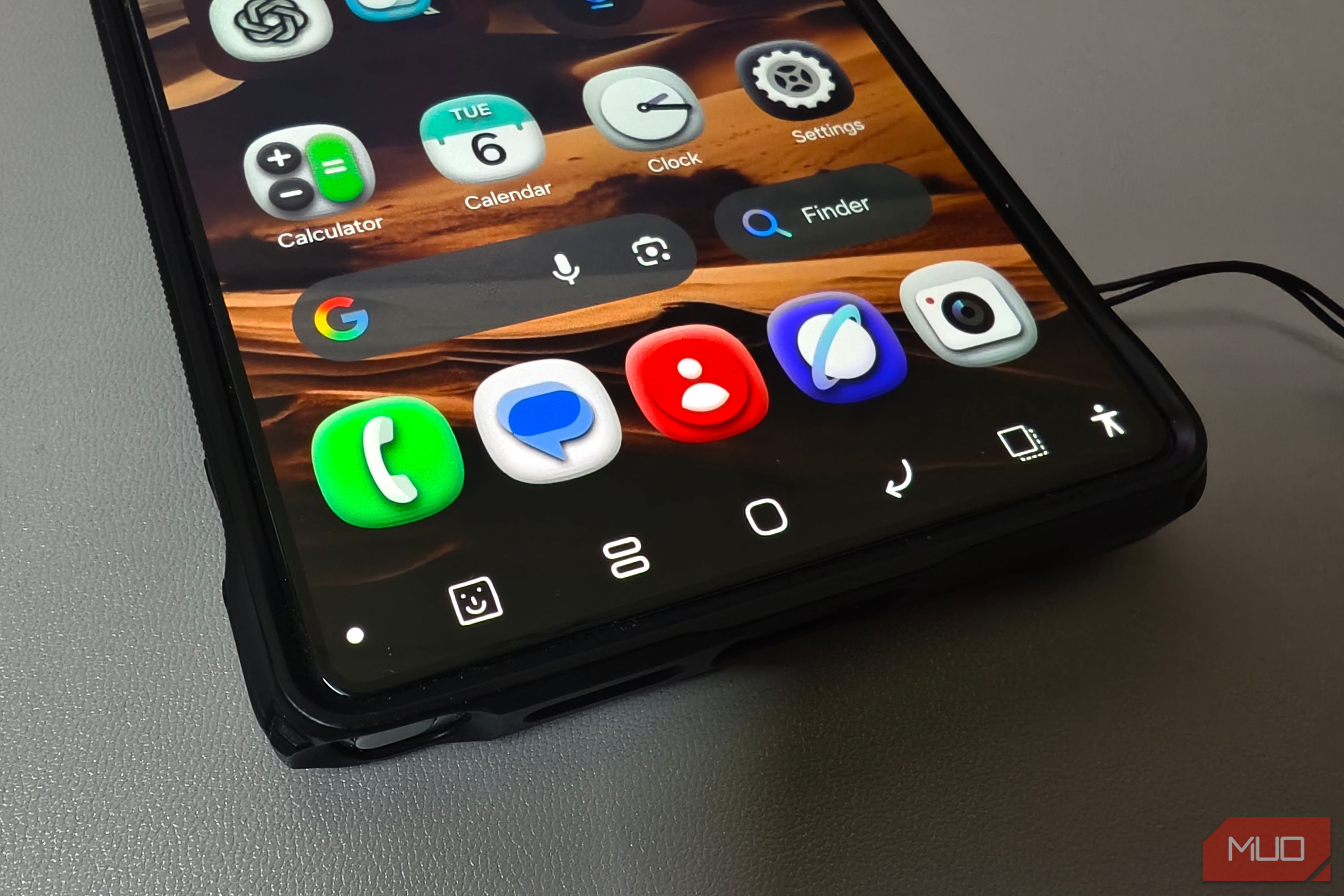
Inside NavStar, toggle the module on, stay on the Buttons tab, and tap New configuration. The editor opens with two sections: Button layout and Icons. In Button layout, selecting Add button reveals a grid of system actions where you can assign up to two extra buttons. Long-press and drag icons across the preview strip to match your natural grip. The Icons tab lets you swap any symbol for a custom shape, a gallery photo, or even a sticker.
I went with screen capture and screen off. Screen capture replaced the awkward two-hand squeeze on the side key and volume button that never felt natural on a 6.9-inch phone. Locking the display is now a single tap instead of shifting my grip to reach the side key.
Back on NavStar’s main screen, a toggle under Advanced options adds the show/hide dot to the left side of the bar. Double-tap it, and the entire strip tucks out of sight. A quick flick up from the glass rim brings it right back. Five buttons when I need them, full screen when I don’t.
Remapping the rest of your Galaxy
Taming the bottom edge of the display makes a huge difference, but you don’t have to stop at on-screen controls. RegiStar, another module inside the same app, picks up where standard hardware buttons left off. It lets you reassign the side key long-press away from Bixby to the flashlight, Google Assistant, or any other app. It also adds back-tap detection, turning a quick double-tap on the rear glass into an instant physical trigger. Stack those hardware shortcuts on top of a custom five-button dock, and a giant 6.9-inch slab stops feeling like a two-handed chore.
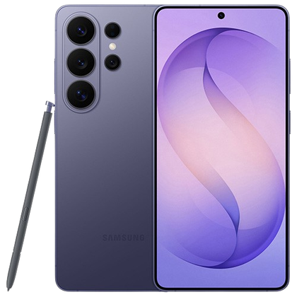 Samsung Galaxy S26 Ultra
- SoC
- Snapdragon 8 Elite Gen 5
- Display
- 6.9-inch Dynamic Super AMOLED 2X
- RAM
- 12 or 16 GB
- Storage
- 256GB, 512GB, or 1TB